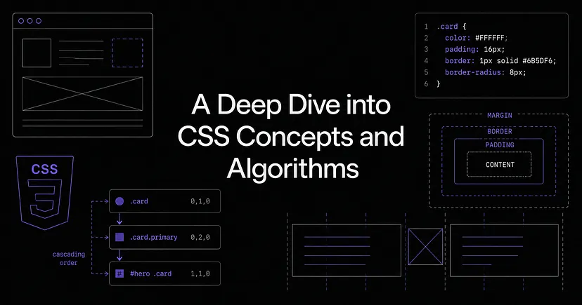
A Deep Dive into CSS Concepts and Algorithms
Before you can write good CSS, it helps to understand what's actually happening under the hood. Not just the syntax , but why stylesheets exist, how the browser processes them, and what happens when things conflict.
Why stylesheets exist
Early CSS was written directly on HTML elements as inline styles. It worked, but it was a nightmare, as there was no reusability, your structure and styling were all tangled together, and your HTML files got huge fast.
External stylesheets fixed this by separating concerns: your HTML describes the structure and your CSS describes how it looks. Frameworks like Tailwind took this even further, but that's the origin of the idea.
Flash of Unstyled Content (FOUC)
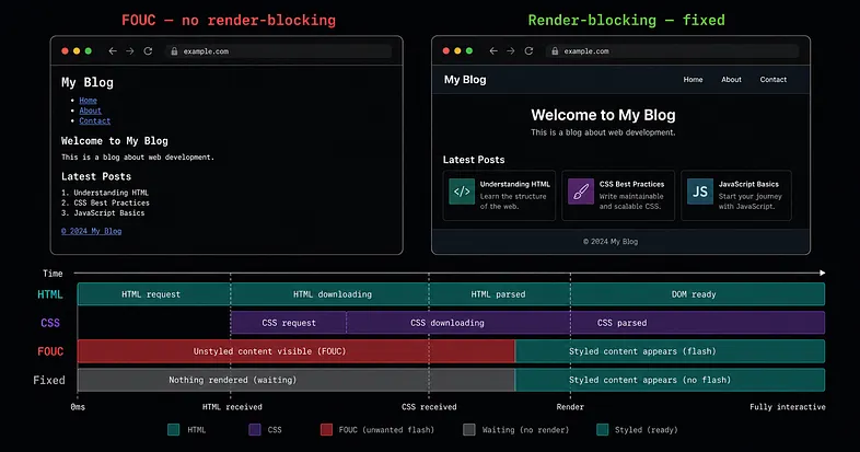
Ever loaded a page and seen it flicker, such as raw text, no styling, then suddenly it looks normal? That's FOUC.
This happens because the browser starts rendering HTML straight away. If your CSS file hasn't finished downloading yet, the user sees the unstyled page for a split second before styles kick in.
To stop this, browsers treat CSS as render-blocking. They pause rendering completely until the stylesheet is fully loaded. It's a tradeoff as it slows things down slightly, but it means users never see that ugly flash. This is also why keeping your CSS small matters. Smaller file, shorter block, faster page.
Reading CSS — the PSA model
A CSS rule is made out of three things: a selector, a property, and a value. The selector points to the element you want to style. The declaration is the property and value pair inside the curly braces.
When you're reading someone else's CSS try and group the properties into three buckets:
- Position — where is the element? (top, left, position, z-index)
- Size — how big is it? (width, height, padding, margin)
- Appearance — what does it look like? (color, font, background, border)
By doing so, it makes reading a block of unfamiliar declarations much faster.
Selectors
A CSS selector is how you reference a DOM element to apply a style rule to it. They can be simple or combined.
header h1 {
  /* any h1 anywhere inside a header */
  color: red;
}

header > h1 {
  /* only an h1 that is a direct child of header */
  color: red;
}

h1.heading {
  /* an h1 that also has the class "heading" */
  color: blue;
}
The > combinator is easy to miss but it matters asheader h1 reaches as deep as it needs to whereas,header > h1 stops at one level.
The Cascade Algorithm
Here's something that trips a lot of people up. When a page loads, multiple sources of CSS are all trying to style the same elements at once, your styles, browser defaults, maybe a third party stylesheet. How does the browser decide which one wins?
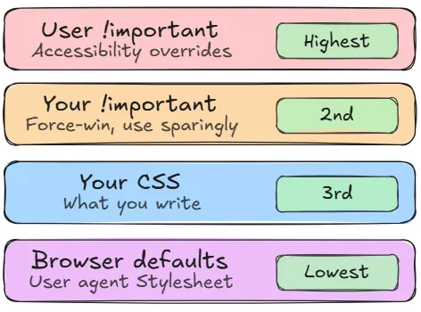
That's what the Cascade Algorithm does. It checks three things in order:
- Origin and importance — where does the style come from? Browser defaults sit at the bottom. Your CSS sits above them. !important jumps to the top. There's one exception — !important in a user accessibility stylesheet beats even your !important. That's intentional, so accessibility can never be overridden.
- Specificity — calculated as three separate columns: IDs, classes, and elements. One ID always beats any number of classes. One class always beats any number of element selectors. The columns are compared left to right, not added into a total score.
- Source order — when two rules have the same specificity, the one that comes later in the file wins.
Side-note on inheritance
Inheritance is separate from the cascade. When no rule is specified on an element, it picks up certain properties from its parent automatically. Mostly text stuff — color, font-size, font-weight. Things like margin and border don't inherit, which makes sense when you think about it.
User Agent Stylesheets
Every browser ships with a default stylesheet also known as the User Agent Stylesheet and it's why h1 is big and bold, and why links are blue and underlined before you've written a single line of CSS.
The problem is that these User Agent Stylesheets are slightly different across browsers. So the first thing in your stylesheet should always be a CSS reset or normalize file if you'd like to wipe those inconsistencies and give you a clean, consistent starting point.
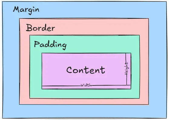
The Box Model
Every element on the page is a rectangular box, made up of four layers:
- Content
- Padding
- Border
- Margin
The content is the innermost layer (your text, image, or whatever the element holds). Padding is the space between that content and the border. The border wraps around both. And margin is the space outside the border, pushing other elements away.
The browser can size a box in two ways:
- Intrinsic — let the content decide the size. This is the default.
- Extrinsic — you set a fixed width. The risk is overflow if the content is bigger.
Here's where people get caught out. When you set width: 200px, that's the content box only. Padding and border are added on top:
width: 200px + padding: 20px each side + border: 2px each side = 244px total
Add box-sizing: border-box and that changes. The width you set becomes the total meaning that padding and border will live inside it, not on top.
Layout Algorithms
Every element on the page needs to end up somewhere. The browser figures out where by running each element through a layout algorithm, which represents a set of rules that determines its size and position relative to everything else.
The default is Flow layout, and its mental model is simple: the page is a document, and everything flows like text. Elements are either block-level or inline.
Flow layout's document-first assumptions make it the wrong tool for many modern layouts. Centering something vertically, distributing space evenly between items, making a sidebar that stretches to match the main content's height, none of these are natural in flow layout. That's why Flexbox and Grid exist, giving you direct control over alignment, spacing, and distribution in one or two dimensions.
- Block-level elements — div, p, h1, section — take up the full width available and stack vertically, one after another. It doesn't matter if the content is only a few words wide, a block element stretches to fill its container and forces the next element onto a new line.
- Inline elements sit within the flow of text, taking up only as much width as their content needs. span, a, strong — these sit side by side, wrapping only when they run out of horizontal space. You can't give them a top or bottom margin, and setting an explicit width or height will do nothing.
- There's also a middle ground: inline-block. These flow with surrounding text like inline elements, but accept width, height, and vertical margin like block elements.
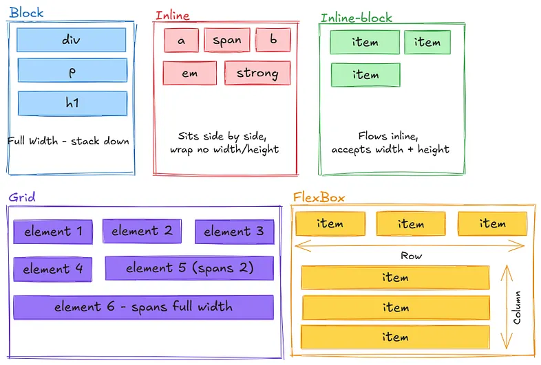
When to use which:
- Block: for vertical flow and full width sections
- Inline: for text-like content and small elements
- Inline-block: for inline flow with custom sizing
- Flexbox: for one-dimensional layouts (row or column)
- Grid: for two-dimensional layouts (rows and columns)
- Position: for precise control and overlapping elements.
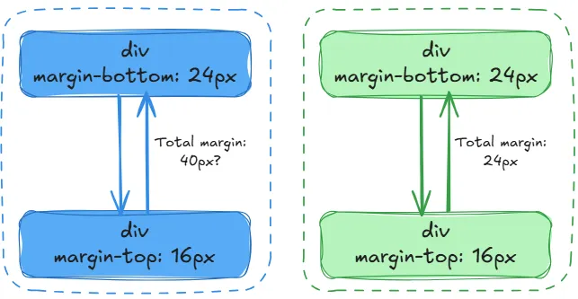
Margin Collapsing
Vertical margins between block elements don't always add up, they sometimes merge into whichever is larger. It only happens when:
- The margins are vertical (horizontal margins never collapse)
- Both elements are display: block
- They're touching — no padding, border, or anything between them
Why does the browser do this?
It was actually a deliberate design decision from the early web. Back when the web was just documents, you'd have lots of headings and paragraphs stacked on top of each other. If every <p> had margin-top: 20px and margin-bottom: 20px, the gap between two paragraphs would be 40px — way too big. Collapsing meant the gap stayed at 20px, which looked more like a printed document.
So it was designed for readability in text documents. It just became confusing when people started using CSS for layouts.
Block Formatting Context (BFC)
A BFC is just a container that takes full responsibility for everything inside it. Normally, floated elements are invisible to their parent — the parent collapses and ignores them. A BFC fixes that. Once a container becomes a BFC, it wraps around its floated children properly and nothing inside it bleeds out or interacts with the outside world.
You create one without realising it all the time: overflow: hidden, display: flex, display: grid, position: absolute. Any of those on a parent triggers it.
The classic example is a parent div collapsing to zero height because its children are floated. Add overflow: hidden and it snaps back. The parent is now saying, everything inside me stays inside me.
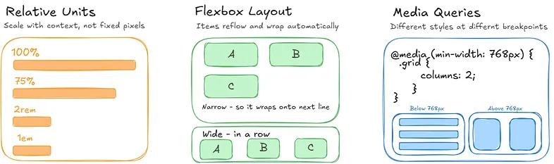
Responsive Design
Responsive design means building a UI that works across different screen sizes, not a separate mobile site, just one layout that adapts.
Three things make it possible:
- Relative units that scale with context rather than locking to fixed pixels. Use percentages, rem, or em as these adapt to their context and scale naturally.
- Layout Algorithms like Flexbox that can reflow and wrap content automatically.
- Media queries that let you apply different styles at different viewport breakpoints.
The CSS Build Pipeline
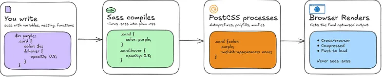
Vanilla CSS now has custom properties (variables), native nesting, and functions like calc(), min(), max(), and clamp()and are all supported in modern browsers without a build step. For small to medium projects, that's often enough. At scale though, Sass still earns its place for things like mixins, loops, and more advanced abstractions.. Sass fills that gap as you write .scss files using its extended syntax, and Sass compiles them down to plain CSS that the browser can read.
That compiled CSS then passes through PostCSS, which processes it further. It adds vendor prefixes so properties work across browsers, polyfills modern CSS features for older ones, and minifies the output by stripping whitespace and comments. The browser receives a single, clean CSS file at the end, it never sees your .scss or anything Sass wrote in the middle.
CSS in Large Codebases
The bigger a project gets, the messier CSS becomes such as class name conflicts, no clear conventions, visual inconsistency across components. Therefore, a few approaches have emerged to deal with this.
BEM
BEM (Block, Element, Modifier) is a naming methodology that prevents class conflicts by making the relationship between blocks, elements, and modifiers explicit in the class name (e.g. .card__title — large).
Imagine you're on a big project with a few developers. Everyone's writing CSS and at some point two of them both write a class called .title. One styles it red, one styles it blue. Now you have a conflict and no idea where it's coming from.
BEM forces you to never write just .title. Instead you'd write:
.article__title {
}
.card__title {
}
.modal__title {
}
Now they can never clash because the block name (article, card, modal) is baked into the class itself. You always know exactly what component a style belongs to just by reading the name.
Atomic CSS
Atomic CSS uses single-purpose classes to style elements, optimising for simplicity and shipping the minimum amount of CSS. The first implementation was Atomizer (2014), followed by Tailwind CSS (2017). One class does one thing, styles are reusable, and changing HTML structure won't break styling. The less CSS you ship the better, since CSS is render-blocking.
<button class="bg-blue-500 text-white px-4 py-2 rounded">Submit</button>
CSS-in-JS
Styled Components is a React library that lets you write CSS directly inside your JavaScript files, attached to the component it belongs to. There's no separate stylesheet, no class names to think up, the styles live with the component and are scoped to it automatically.
Two developers can both write color: red in their respective components and nothing clashes, because the library generates unique class names behind the scenes. Different approach to the same problem, but it fits naturally if you're already thinking in components.
PS: This is based on my own research and understanding of how CSS works. I'd always recommend double checking other resources if you want to go deeper. I wrote this mostly for myself, but if it helps someone else along the way, that's a win. Thanks for reading.